Handwriting

When I was 11 years old, I changed my handwriting in an effort to be cool. I wanted to be more like my friend. He wrote with far more flair than I did. His pages had words that stood out at you. They were all in in neat rows, but they looked artistic and full of purpose. His paragraphs were all in joined up writing and each word was at an angle. His pages looked like they came from someone interesting. Mine just looked like they came from a bog standard 11 year old kid.

I remember clearly deciding to write an assignment in this new style – with my new found flair. The words were all at a painful angle across the page. It took me ages to finish because I was more interested in how it looked than what was written. I put my name on it and handed it in. I felt satisfied and liberated. My new, cooler, more angular identity was emerging.

When the teacher handed our marked papers back, he stopped when he reached me. I got a poor mark. He was disappointed with me, he said. And what on earth was wrong my handwriting? He could barely read it.

I couldn’t hide my blushes as I mumbled some sort of response. I reverted back to myself the very next class.

Happy Sunday chimps. To thine own self be true!
Contrast = interesting to humans

I once asked my dad why he liked The Rolling Stones so much. His answer was that they understood the need for highs and lows in a song.

It is hardwired deep in your nervous system. The senses that we humans have developed over millennia of evolution – touch, smell, sight, hearing – are made up of nerve cells linking to our brain. These nerve cells respond better to a sudden change than they do to repeated stimuli.

What does this mean? It depends on the situation.

For Mick Jagger and the boys it means that their songs have light and shade. Quiet verses and soaring choruses. Jagger will whisper and then he will growl and roar.

For emergency response vehicles it means the loud sirens are designed to be varied, sharp and with many different patterns so as to be noticed over the noise of everyday traffic. This contrast works better than one continuous noise which is easily filtered out by the human ear.

For creative people, I think it means that if a piece of art is not getting the desired response, then one of the first things to assess is the use of contrast – light and shade, highs and lows.

Contrast = interesting to humans.

Work and play

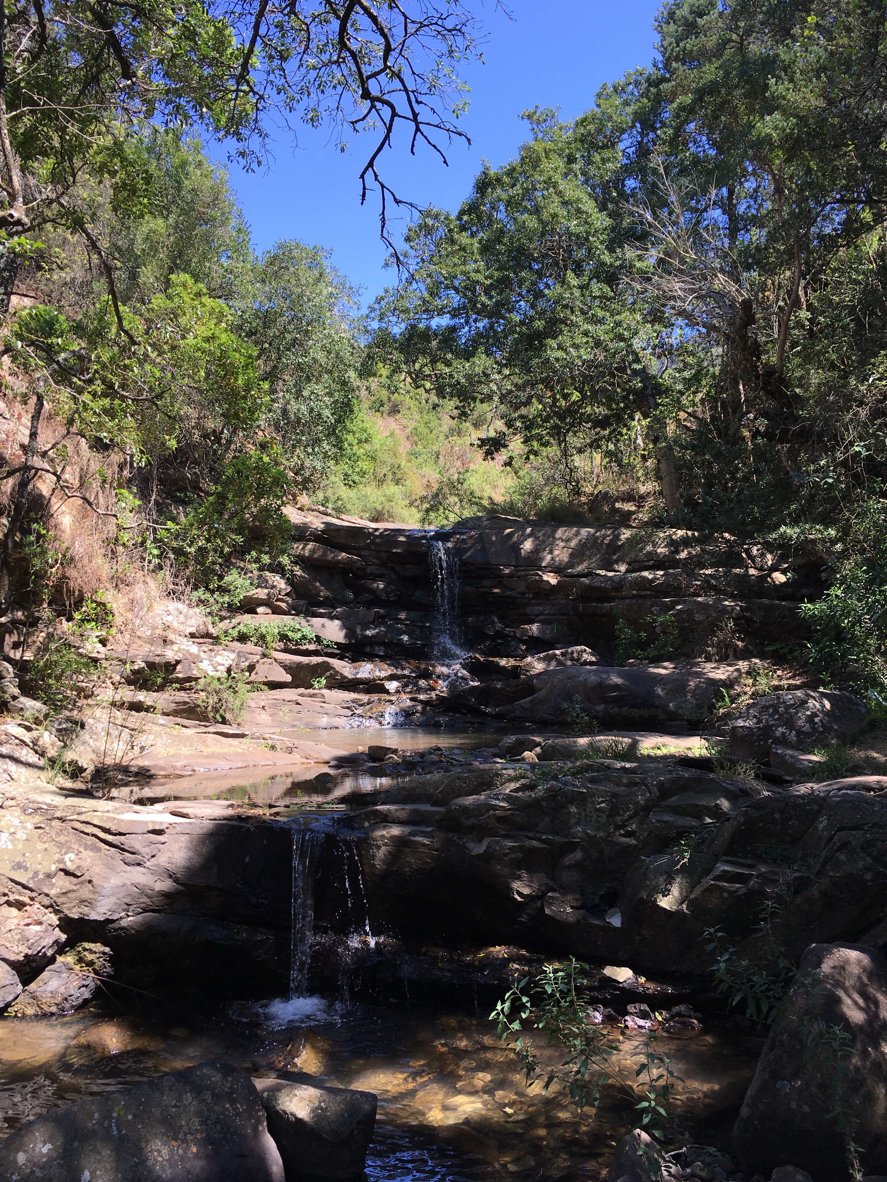
We went on a beautiful hike this morning. You can get an idea of the vibe from the pic below.

When I got back I had a look at my phone: Meeting requests, complaints, fires to put out all over the place from work.

The contrast is jarring. But at least with a software based business it is possible to travel and work at the same time.

I need to practice juggling the two because I’m loving the hikes but I need to pay for it somehow!

Contrast

Some thoughts on contrast:

In the world of fashion, I’m told it is a good rule to follow to wear one piece of clothing as the focus for your outfit. Make the focus piece obvious (colourful and/or patterned) and make all your other clothes darker and more plain in comparison. For example a brightly coloured, patterned shirt as the focus, and plain dark pants, jacket, and shoes to support. It is the contrast which makes it work. If it was all bright patterns, it would clash and likely not be pleasing to the eye. The same if it was all black. No contrast. Boring. Slightly morbid too!

The same thing happens in food. Eating a chocolate, washing it down with a sweet soda and an ice cream with syrup on top. It’s too much of a good thing. No contrast. Food manufacturers have figured out the perfect balance of salt, sugar, and fat to tease our senses. There needs to be a contrast in tastes, and in food types to satisfy truly.

The same with music and audio. A piece of music needs to have light and shade to work. A whole song of thrashing guitar solo after guitar solo is just too much and becomes very boring. Too much bass in the mix gives you a headache. Use light and shade to build up to a crescendo however, and it will raise the hairs on your neck.

Contrast is the way forward!

Contrast

I watched two movies last night. With family away I could indulge myself a little. The two could not have been more different.

Anomalisa is an extraordinary film which made me think and reflect. To quote Rolling Stone: “There’s explicit sex, profound sadness, jokes about the Cincinnati Zoo and hotel-door keycards, heartbreak, hilarity, and a half-naked Japanese automaton that both sings and spits out bodily fluids”. All of this is in stop motion animation. Throughout the film a sense of the protagonist unravelling, and a deft handling of his psychological state keeps you completely absorbed. I could not recommend this film enough. I know it will stick with me for a long time.

At the other end of the spectrum, the second film I watched last night was Star Trek Into Darkness. Intergalactic adventure, beautiful girls, a bromance and a bad guy for the ages make this an easy watch. It requires far less concentration than Anomalisa, but it is topical, and still has heart and substance in spades. Loved it.

Contrast in all things is good. It makes life interesting. Dark pans, light shirt. Artistic stop motion animation and a blockbuster. My life is driven by routine and the two girls in my life. For a night the two girls were away and I could change up the routine and binge watch to my heart’s content.